Project Detail
Proud Projects That Make Us Stand Out

Project Info
- Client: Peter Wright
- Category: Business, Campaign
- Date: 6 June 20
- Website: Ride App
- Location: New York
Product Description
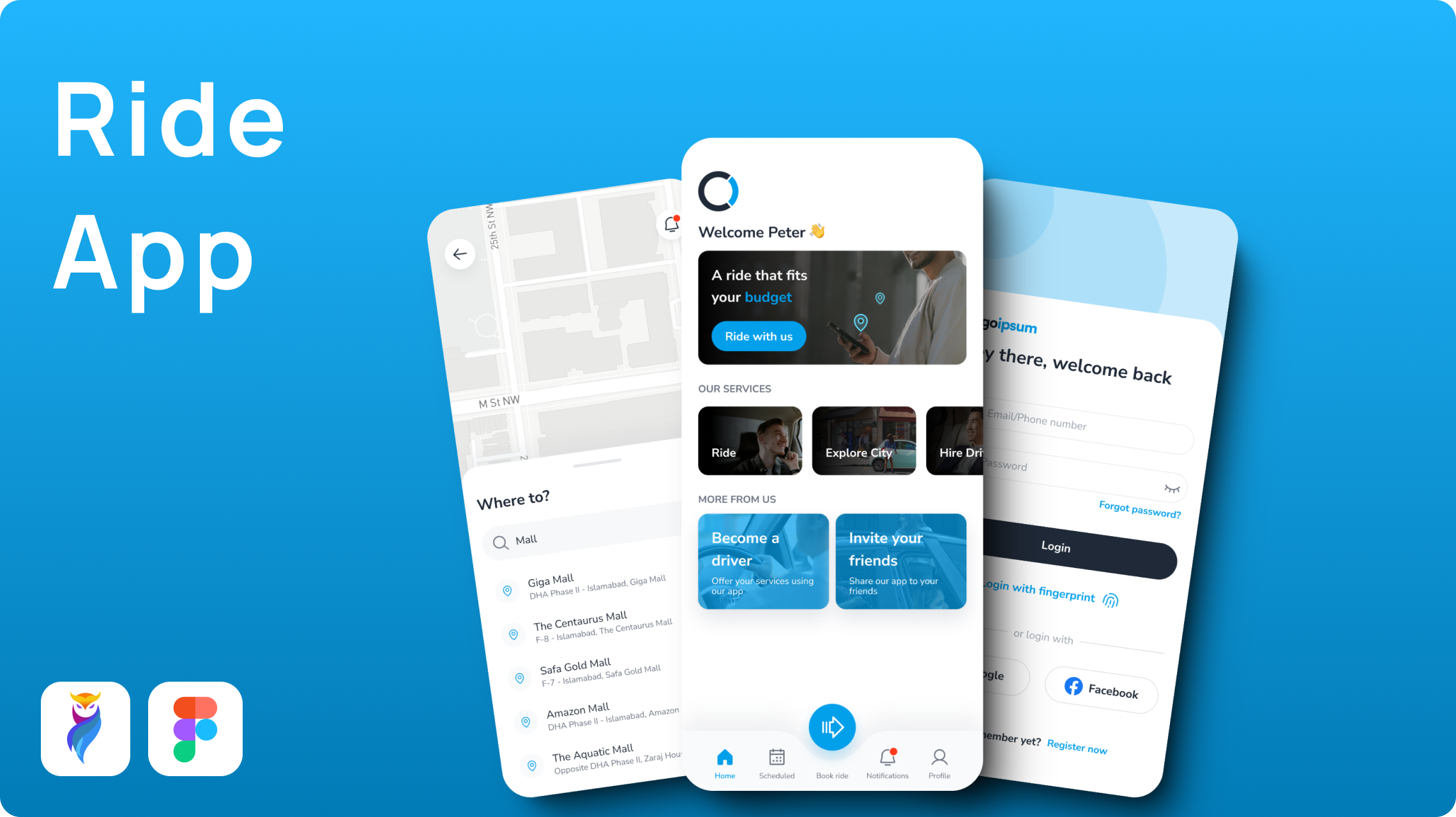
Ride app is a versatile ride-hailing app for USA-based audiences. It is more than a conventional ride-booking app. The app offers unique features which include a tourist section and personal chauffeur service.
The tourist section allows tourists to book rides to famous tourist spots. The personal chauffeur service enables users to hire drivers based on their needs.
Objective and Design Alignment
The Ride App was aimed at standing out from its competitors in the market. For that purpose, it offered users and drivers more flexibility and value. The app allows riders to earn more per trip and gives users an enhanced experience.
Product/Design Challenges
The challenge in this app was to integrate chauffeur service into a standard ride-hailing framework. Additionally, keeping the riders and passengers without separating apps was also a bit of a challenge.
For that purpose, we designed a dual-mode functionality for passengers and riders. To make the app secure, a trustworthy registration process for drivers was integrated.
Solution
The app design was a challenge due to the unique features in the app like chauffeur and tourist spots. So we created distinct sections within the app for tourists and chauffeurs.
The design we created, aimed to be modern and minimal, with user-friendly navigation and user flows. The Sky Blue (#029FEB) provided the design a modern and user-friendly look in contrast with Slate Grey (#1F2937).
The font choice was “Nunito Sans” which gave the design a clean and approachable look.
Approach
Step 1: User Research
We started our user research by keeping three kinds of user personas. First, a regular user who is using this app for daily commute.
Second, a tourist who is new to the city and wants to explore it. Third, an elite user who is having a busy day or on vacation with family and wants personal chauffeur services.
These user personas helped us figure out the pain points of our target audience and helped us to come up with solutions for them.
During our research, we implemented a design solution for tourists and chauffeur services by creating separate sections within the app.
Step 2: Mapping User Flows
We started our design process by creating user flows that aimed at user-friendliness. These user flows were mainly for standard ride booking, chauffeur services or switching between rider and passenger mode.
This foundation helped us to create a smooth app experience for the users.
Step 3: Wireframing
Based on the user flows, we wireframed the app. This step helped in laying out a fundamental structure. It ensured that features were easy to access and navigate.
Step 4: Establishing Visual Identity
For a visual identity, we had a modern and corporate design concept from our research. Visual identity is mostly based on colors and fonts we use for the brand.
We picked Sky Blue (#029FEB) to keep a calm and trustworthy vibe while Slate Grey (#1F2937) to keep a sophisticated contrast. For better readability and modern appeal, we chose the “Nunito Sans” font.
Step 5: Integrating Chauffeur Services
To solve the challenge of chauffeur services, we integrated a distinct section within the app. This section allowed users to search, chat with and book chauffeurs based on their needs.
It assures users of acknowledging the exceptional value proposition the Ride App provides.
Step 6: Dual-Mode Functionality
In the end, we designed the dual-mode system. It allowed users to swap between rider and passenger modes seamlessly. The driver registration process was made secure with some additional features.
Client Testimonial
It was an absolute pleasure to work with the design team of the Ride App. They understood our design and feature requirements clearly. The design looks visually appealing and beautiful. They did a great job taking this design as a challenge and cracked it. It would be a pleasure to work with them again.


