Project Detail
Proud Projects That Make Us Stand Out

Project Info
- Client: Robert Lewis
- Category: Business, Campaign
- Date: 6 June 20
- Website: Nursing Agency
- Location: New York
Product Description
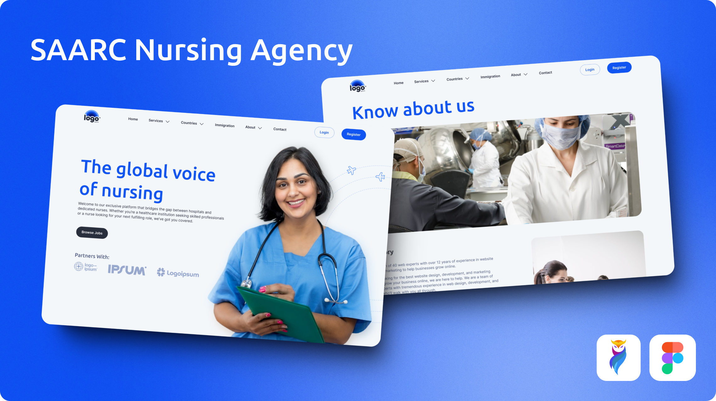
SAARC Nursing Council is a job and information portal designed especially for medical graduates and nursing students in SAARC countries.
The platform connects users looking for job opportunities in Western countries like Germany, Spain, Italy, the USA, the UK, France, and Lithuania.
The portal offers vacancies in various medical fields including Nurses, Surgeons, Dispensers, Chemists, Lab Technicians, and Specialists.
Objective and Design Alignment
SAARC Nursing Council was designed with the goal of a professional and trustworthy platform. Its goal was to provide opportunities for medical professionals to look for job opportunities abroad.
The web design had to have a corporate look for its significant purpose. Smooth navigation and user-friendliness were a must for this kind of website.
Product/Design Challenges
The website needed to convey reliability and professionalism to attract job seekers and employers. So, it presented a challenge to maintain a professional look while attracting users from different educational backgrounds.
Another challenge was incorporating a subscription model where users could access job listings and newsletters.
Solution
To encounter these design challenges, we aimed for a clean and professional design. For that, we used Royal Blue (#1054F1) as our primary color along with Slate Blue (#292E3D). This palette encourages trust and stability.
“Ubuntu” font was our first choice for headings and display texts and “Inter” font was used for body and captions. These fonts ensured the readability and consistent look.
Overall, these design choices ensure the site has a stylish and corporate feel.
Approach
Step 1: User Research and Insights
We started the project with user research. It helped us understand the needs of medical graduates and nursing students from SAARC countries.
Based on the feedback, we understood the pain points of users looking for international jobs. One of the issues we noticed was that most portals don’t provide a detailed process and guidance for the job process.
This research guided us in making the site with clear instructions and seamless flows.
Step 2: Designing the Visual Identity
From our research, we made the decision that the website needs a look that conveys professionalism and trust.
Upon further research, Royal Blue (#1054F1) and Slate Blue (#292E3D) were selected as our primary color choices. This color combination delivers a feeling of trust and security.
The “Ubuntu” and “Inter” fonts were used for headings and body respectively. The font choices complemented our design’s visual appeal.
Step 3: Structuring the User Flow
We mapped out an easy and intuitive user flow for the target audience. This made it easy for users to explore jobs, register on the portal, and submit their applications.
We made sure that the registration process was easy and concise, requiring users to upload their documentation with clear instructions.
Step 4: Implementing the Subscription Model
To make sure that only serious persons could use this portal, we included a subscription model. This model allowed users to access job listings and receive newsletters.
The subscription procedure was kept simple, with clear pricing, benefits and instructions for users.
Step 5: Testing and Feedback
A final testing was done to make sure that the website meets the users’ needs. Feedback was gathered for final adjustments, ensuring the portal was functional for real people.
Client Testimonial
Working with the design team was a great experience. They understood our needs and delivered the product according to our expectations. The site looks great and works perfectly. They did an excellent job. We’re very pleased with the results.


