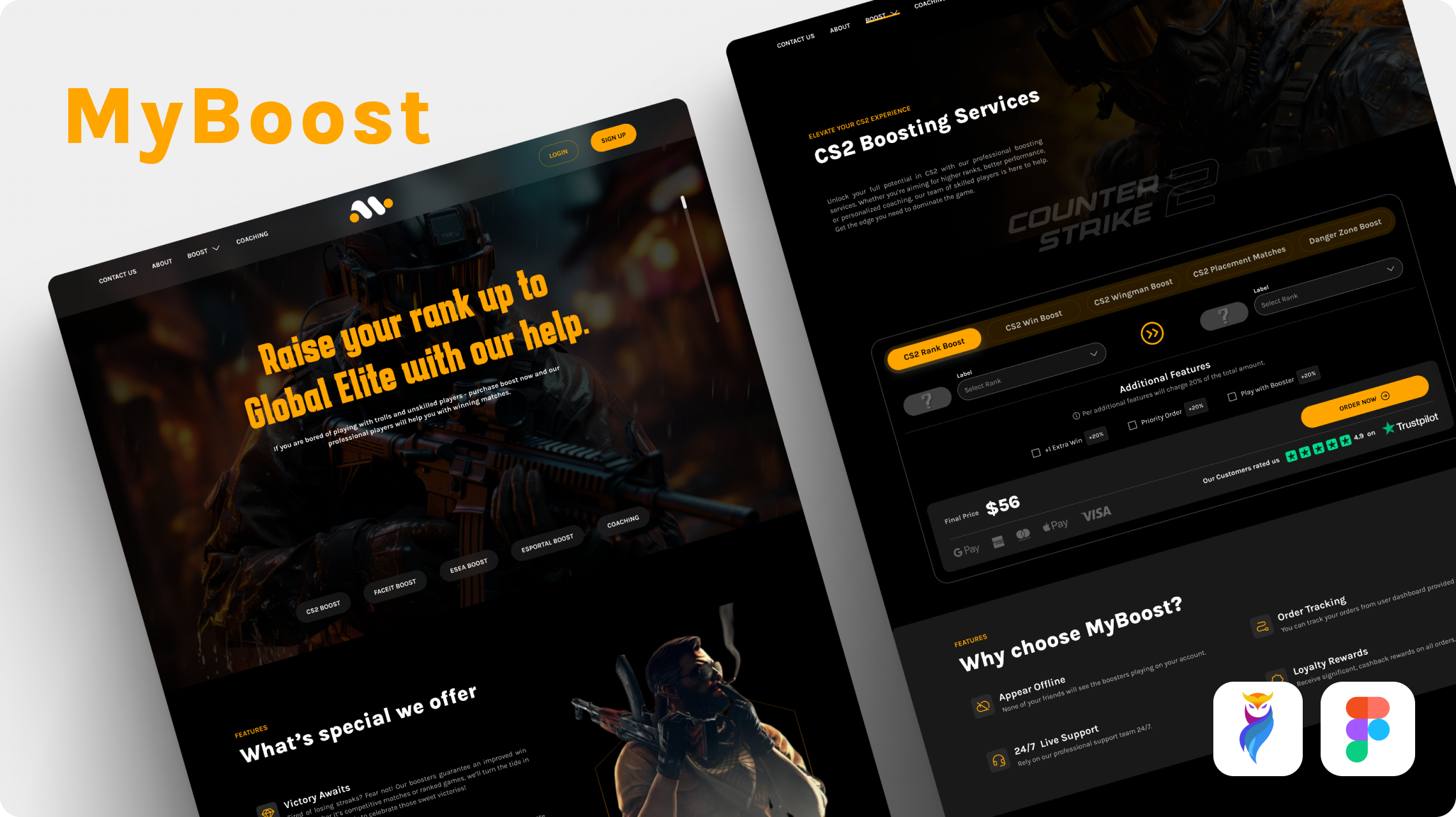
Project Overview
MyBoost is a platform that provides boosting services for CS: GO, CS2, Esportal, Faceit and ESEA, along with coaching services for gamers. The platform needed a design that would draw in serious gamers and distinguish itself from competitors in the market, with an emphasis on security, trust and a unique appearance.
The Challenge
MyBoost faced many competitors, making it a challenge to differentiate the platform from others. A further challenge was that users had to trust their valuable gaming accounts to the service, so the website needed to communicate trustworthiness clearly through how services were explained and presented.
What We Improved
We designed a dark-themed website complemented by vibrant orange highlights, creating a sleek, modern aesthetic that appeals to the gaming community, and used bold visual graphics to reinforce the gaming vibe while making sure services were clearly explained to build user trust.
User Research & Market Analysis
We researched the needs and preferences of the gaming community, analysed competitor sites and gathered feedback from gamers to recognise what was missing in the market, which guided our design decisions.
Visual Identity
We chose a dark theme that resonates with the gaming aesthetic, using "Jet Black" (#000000) as the primary background for an elegant, immersive experience and "Vibrant Orange" (#FFA500) for contrast on buttons, highlights and crucial elements. We selected "Karantina" for display elements and "Karla" for headings and body text, balancing style with readability.
User Experience
We created a seamless user experience with all services clearly outlined and easy to access, structuring the site to guide users smoothly through every service with clear explanations.
Visual Graphics
We integrated bold visuals to enhance the gaming vibe alongside the dark theme and orange accents, appealing to gamers while reinforcing the professional, secure nature of the services.
Testing & Refinement
We ran user testing with gamers to confirm the site met expectations, then made a few tweaks to refine the design and functionality based on feedback.
Key Deliverables
- User research and market analysis
- Dark-theme visual identity with orange accents
- Service pages with clear explanations
- Bold visual graphics
- Seamless user experience flows
- User testing and refinements