Project Detail
Proud Projects That Make Us Stand Out

Project Info
- Client: Mark Young
- Category: Business, Campaign
- Date: 6 June 20
- Website: linuxgurus.com
- Location: New York
Product Description
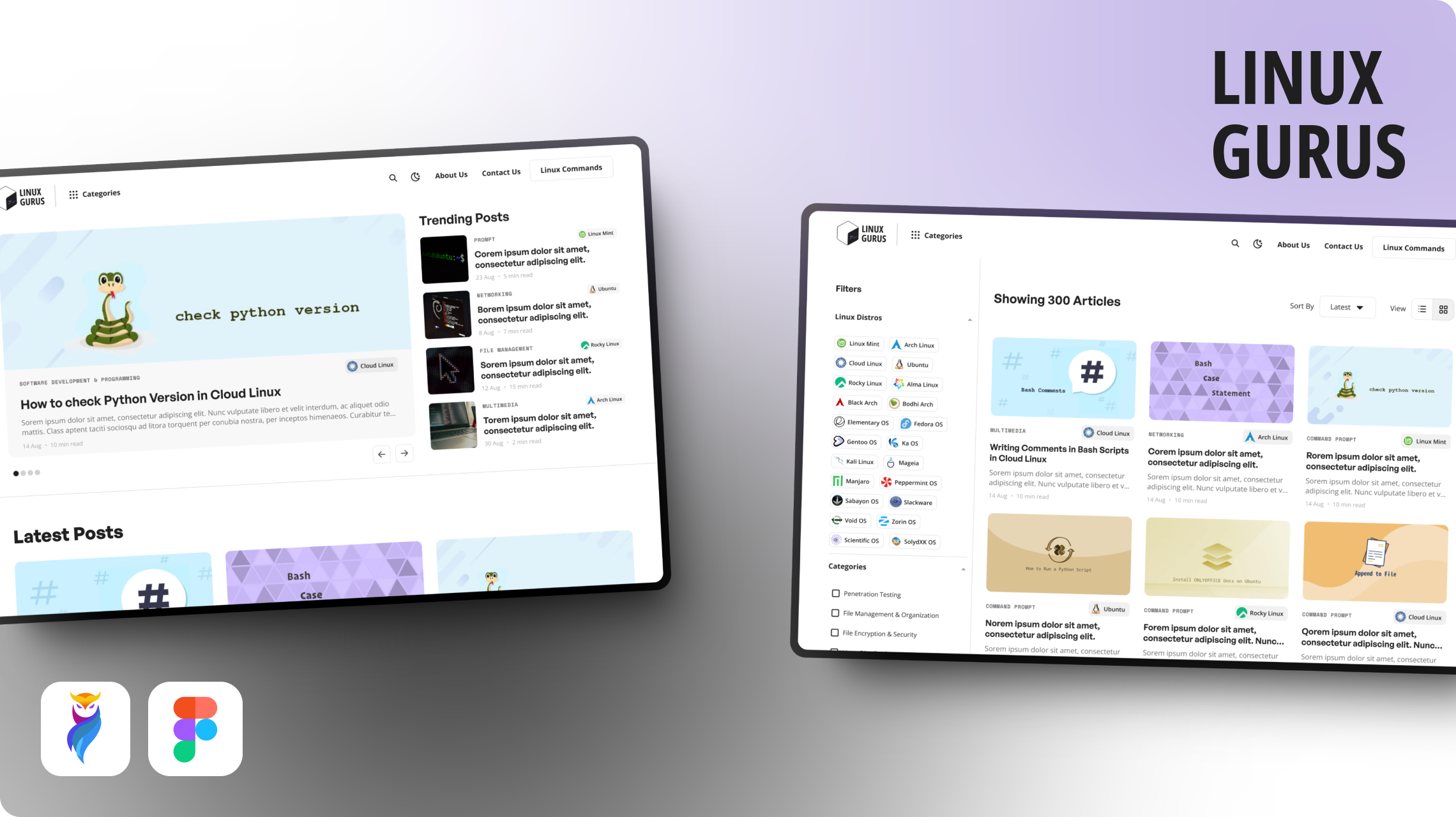
Linux Gurus is a comprehensive tech blog created for people interested to learn about Linux OS. The site offers articles on every Linux OS topic imaginable for beginners and experienced users.
It was created to provide a deep look at all Linux categories and offers a dedicated section for Linux commands.
Objective and Design Alignment
The goal was simple and clear. It was to create a minimalist, user-friendly blog with a fresh and modern feel. For user preferences, the design required both light and dark modes.
Additionally, the brand needed to be cohesive to all modes and platforms. So we created logo variations for different backgrounds.
Product/Design Challenges
The biggest challenge lies in balancing simplicity with depth. The site contained a vast library of Linux articles and command references, but it needed to feel lightweight and minimal.
Additionally, it was a unique design challenge to create a logo that remains consistent and readable across different themes and backgrounds.
Solution
We needed a clean, functional design that allowed the content to shine.
For colors, we picked Royal Purple (#5D1FC9) as the primary color along with Charcoal Black (#1F1F1F) which gave the site a modern yet understated look. The colors worked harmoniously across both light and dark themes.
We used “General Sans” as the primary font for headings and display texts. While “Open Sans” was chosen as a secondary font for subtitles and body text.
In terms of branding, we crafted a cubical logo featuring a filled side with a command icon. This symbolized the command-line power of Linux.
Approach
Step 1: Understanding User Needs
We started by recognizing the needs of the users with research. Linux learners who need access to easy-to-read articles and a reliable command library. With this in mind, we learned that the design needed to be simple, intuitive and focused on offering value.
Step 2: Minimal and Functional Design
The important factor of this project was making a design that felt minimal but rich with content. The purple and black color combination was picked up for its tech-inspired vibe.
Step 3: Branding and Logo Development
The branding for Linux Gurus was very important. We crafted a cubical logo featuring a filled side with a command icon. This symbolized the command-line power of Linux.
The typography for the logo used “Open Sans Condensed” which gave it a strong and readable look. We created three variations for the logo to make sure of consistency.
Step 4: Testing for User Experience
After designing the website, we went through user testing to make sure that the content was accessible and easy to navigate. Based on feedback, we made minor design changes to ensure the best user experience.
Client Testimonial
Our experience with the design team was nothing short of excellent. They fully comprehended our vision for this website. The logo and branding looked fabulous. We’re thrilled with the results and how smoothly the design fits our content.


